


ABOUT
Sahibi is a Kuban creamery, which has been producing and supplying sunflower oil to the market of Central Asia, the Middle East, China, Turkey, the United Arab Emirates and some others since 2013.
Sahibi produces refined and deodorized premium and premium grade oil of four proprietary patented brands: Gold of the East, Golden Edge, Kuban elite, Generous Valley.
the problem is...
Despite the popularity of the plant and its products among the B2B segment, the client, contacting us, noted the problem of the lack of corporate identity and the packaging of their oils that stands out among competitors.
so the goal is...
Design of the corporate identity of the company and updating of packaging (labels) of products.
the list of tasks

Creating of a corporate palette and typography

Creating logotype

Packages (labels) design
logotype design
At this stage, we are developing and offering the client several logo options using analytics, reference data, briefing materials, associations and metaphors.

concepts
A combined view of the logo. The logomark combines the images of a drop and the sun. Associations: oil, vitality, prosperity. Character: conciseness, stability, stability.
A combined view of the logo. The logomark is a combination of drop and grain shapes. Associations: oil, company activities. Character: rigor, stability, seriousness.
A combined view of the logo. The logomark is the image of an oriental jug with a drop of oil. Associations: harmony, well-being. Character: flexibility, reliability, stability.
the final version
The font type of the logo with the monogram logo. The monogram combines the letters "S" and "M", has elegant shapes, but is symmetrical and stable. Also, the letter M in the descending line of the connecting stroke has a distinctive corporate element in the form of a small star. This is a small reference to the geography of working with the southern regions.


Symbols: star, arch

Character: reliability, stability, nobility, confidence

Associations: East, traditions, historicity, protection, patronage
logotype design
At this stage, we are developing and offering the client several logo options using analytics, reference data, briefing materials, associations and metaphors.
concepts
A combined view of the logo. The logomark combines the images of a drop and the sun. Associations: oil, vitality, prosperity. Character: conciseness, stability, stability.
A combined view of the logo. The logomark is a combination of drop and grain shapes. Associations: oil, company activities. Character: rigor, stability, seriousness.
A combined view of the logo. The logomark is the image of an oriental jug with a drop of oil. Associations: harmony, well-being. Character: flexibility, reliability, stability.
the final version
The font type of the logo with the monogram logo. The monogram combines the letters "S" and "M", has elegant shapes, but is symmetrical and stable. Also, the letter M in the descending line of the connecting stroke has a distinctive corporate element in the form of a small star. This is a small reference to the geography of working with the southern regions.
Symbols: star, arch
Character: reliability, stability, nobility, confidence
Associations: East, traditions, historicity, protection, patronage
logotype design
We have provided the client with a detailed guide on how to use the logo, as well as the palette and typography.
logobook

logotype

Logomark
Font writing
Descriptor

Safe space = the width of the letter S.
logotype variants


Logoblock, inseparable part. Used as the main variant.
Logomark. Used as an independentand alternative variant.

brand typography
brand palette
FOR LOGO
FOR brand identity


brand typography
FOR LOGO
FOR brand identity


brand palette
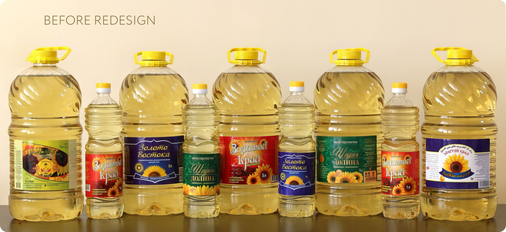
label design
Sahibi oil is supplied in 5-liter and
1-liter bottles. The products are presented in several price categories, patented by four different brands: Gold of the East, Golden Edge, Kuban elite, Generous Valley.
The previous design was expressionless and outdated, did not stand out among competitors and was not remembered by customers.
We have developed and offered the client several packaging (label) design options. Our goal was to update the design, giving it a semantic load, a modern look, taking into account the wishes of the client.

After approval, 3D Visualization of the layouts on the bottles was also performed.
Updating the design in accordance with the customer's requests, new corporate identity and trends in the design of products on the market.

Approval, preparation in print.
3D visualization on the bottles.
label design
This concept of the "Gold of the East" label is made in an oriental style – it is readable thanks to the elegantly oriental font and the accentuated central die.
Gold of the East
The accent in the composition is a sunflower – it attracts attention with its brightness. The "perfect" sunflower conveys to the buyer the feeling of the naturalness of the product and its purity.


label design
Elegance in simplicity. Meet the «Kuban butter Elite», where each element speaks about the quality of the product without unnecessary words. Laconic monochrome sunflowers decorate the left side of the design and, as if a treasure, a golden drop is a symbol of the value not only of the oil, but also of your choice.
Kuban elite
This oil will become more than just an ingredient in the dish; It is a triumph of affordable luxury in your kitchen every day. The laconic design and color scheme emphasize the quality of the product.


label design
The symphony of golden shades, tamed and frozen on the label "Generous Valley" attracts due to the color accent on the shelves. Logo-the name of the product with an emphasis on "generosity" is well read, the image friendly, open, confident
Generous Valley
With such a label, your product doesn't just stand out — it tells a story. The story of the generous borderless fields of sunflowers, where every grain is painstakingly collected so that there is always a piece of summer on your table.


box redesign
We also suggested changing the design of the shipping box.

Понравился проект?
Мы с удовольствием разработаем и для Вашей компании
брендинг или фирменный стиль.
Оставьте запрос, и в течение дня
мы свяжемся, чтобы обсудить ваш проект.
Мы с удовольствием разработаем и для Вашей компании
брендинг или фирменный стиль.
Оставьте запрос, и в течение дня
мы свяжемся, чтобы обсудить ваш проект.

Нажимая на кнопку, вы даете согласие на обработку своих персональных данных.